The puzzling Mercator projection and how aircraft navigate
The Mercator projection or the map that you are used to seeing in school and almost all world maps is pretty confusing once you know the kind of manipulations that go into making it. All my childhood, I thought that Greenland is almost as big as Africa and that Antarctica covers most of the south side of the planet. You can see for yourself in the image below showing the map that we are all used to seeing.
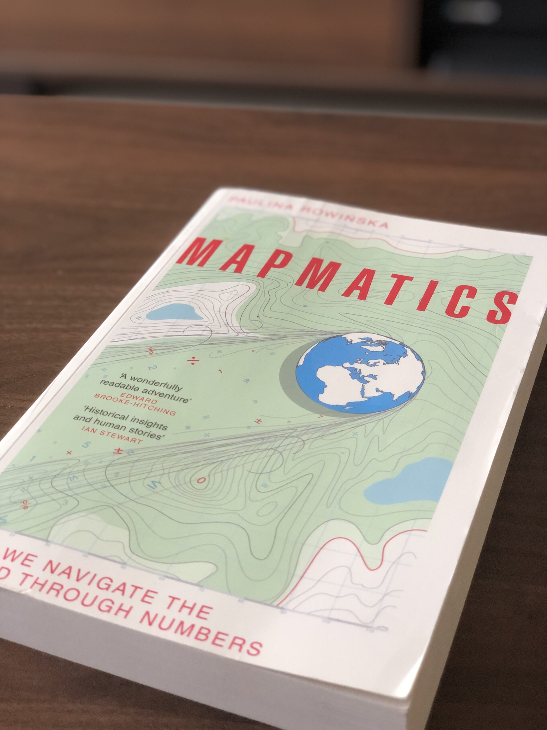
In reality though, the truth is far from it and i only realized that much later in life when I saw a documentary on what map projections are. Very recently, a book was published by the name “Mapmatics” by Paulina Rowinska, which said that it explains what these projections are and everything else about maps. I didn’t think twice and ordered it. I highly reccomend reading. It was a fascinating read and I learnt all kinds of new stuff in it. The book opens by exploring how maps are created and how we came about th efamous Mercator projection. Long story short, you cannot represent something that is a sphere on a flat piece of paper accurately. Some compromises have to be made to do so and that is what causes all the confusion regarding the size of continents.
Gerardus Mercator who originally made this map did so by imagining that there is a lightsource inside the globe at the centre. The globe which would be transparent and having the continents drawn on it would cast shadows on a paper present nearby. The shadows cast on the paper would then create the map that you see above. This method causes those enlarged continents.
Now, coming to another confusing part of using this projection is that all maps on the internet use it and I am going to show one such example and how it changed my view on these inaccurate map. Once while I was flying on a plane from Chicago to Delhi, I looked out the window and saw what looked like the Northern lights. I couldn’t believe it. I always thought that the planes would fly in a straight line from one point to another something like what you see in the image below. It might sound dumb but a lot of us think that way until we know the truth. I would like to thank the education system for making me think that way.
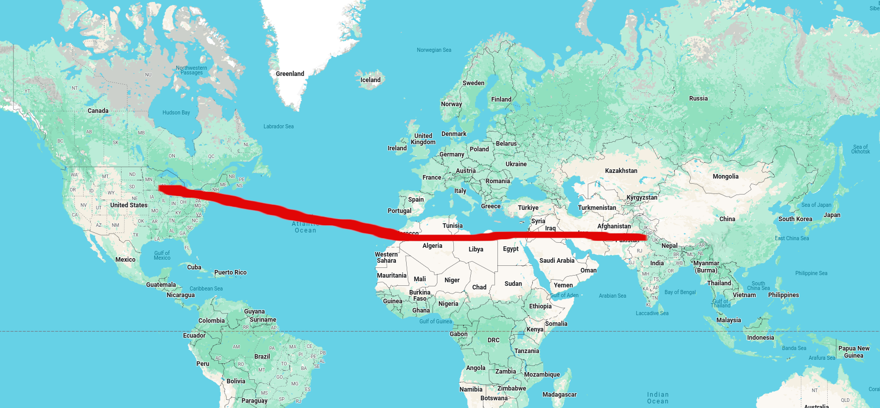
Jokes apart, I had no clue why I was seeing the northern lights when we were flying close to the equator. What gave me a clue was the screen on the seat ahead that showed the flight path and it did not look like what I had imagined. There was no straight line at all.
It showed that we were flying so,ewhere over Greenland that the route looked something like the image above. Some research later I found that the aircraft fly over Greenland during trans atlantic flights. But why? If you have a globe in front of you you could visually see this. Place two pins at the source and destination and tie a piece of string connecting the two and pull it tight. The path that the string takes on the globe is what the aircraft take more or less. You can see for yourself using Google earth if you do not have a globe. We will be doing the string experiment virtually using the tool.
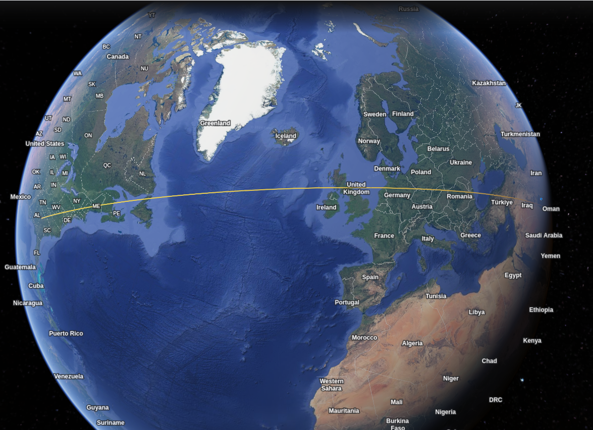
I have plotted the route between Atlanta in the USA and Doha in Qatar. You can try the same by using the polygon tool in the menubar at the top of the page. You then pick the source and destination like before and it will show the path. You can see here that the path passes very close to Greenland and northern United Kingdom.
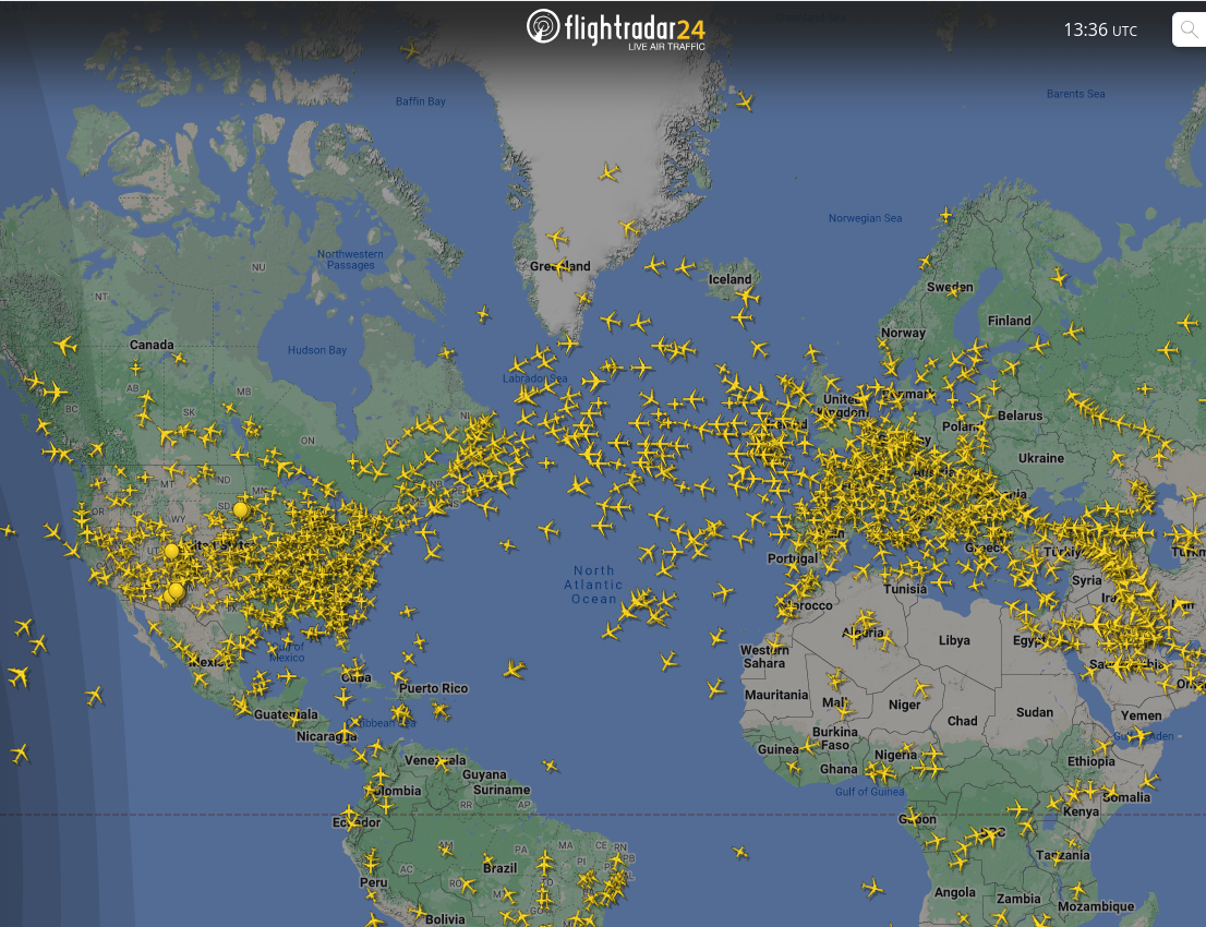
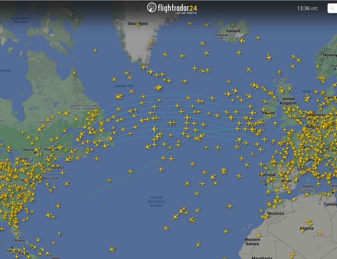
To show you that this is the same path that aircraft take, we will be using the Flightradar24 website. Once you open the website and zoom out you can see a lot of aircraft going across the screen. You can vaguely see that they all seem to follow some sort of path. Take a look at the planes flying over the Atlantic ocean to see for yourself in the image to the left. The image on the right shows the same with the paths turned on and you can see that they follow roughly the path that was plotted on Google earth.
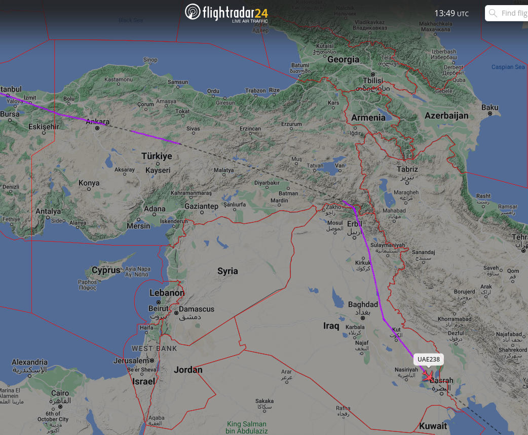
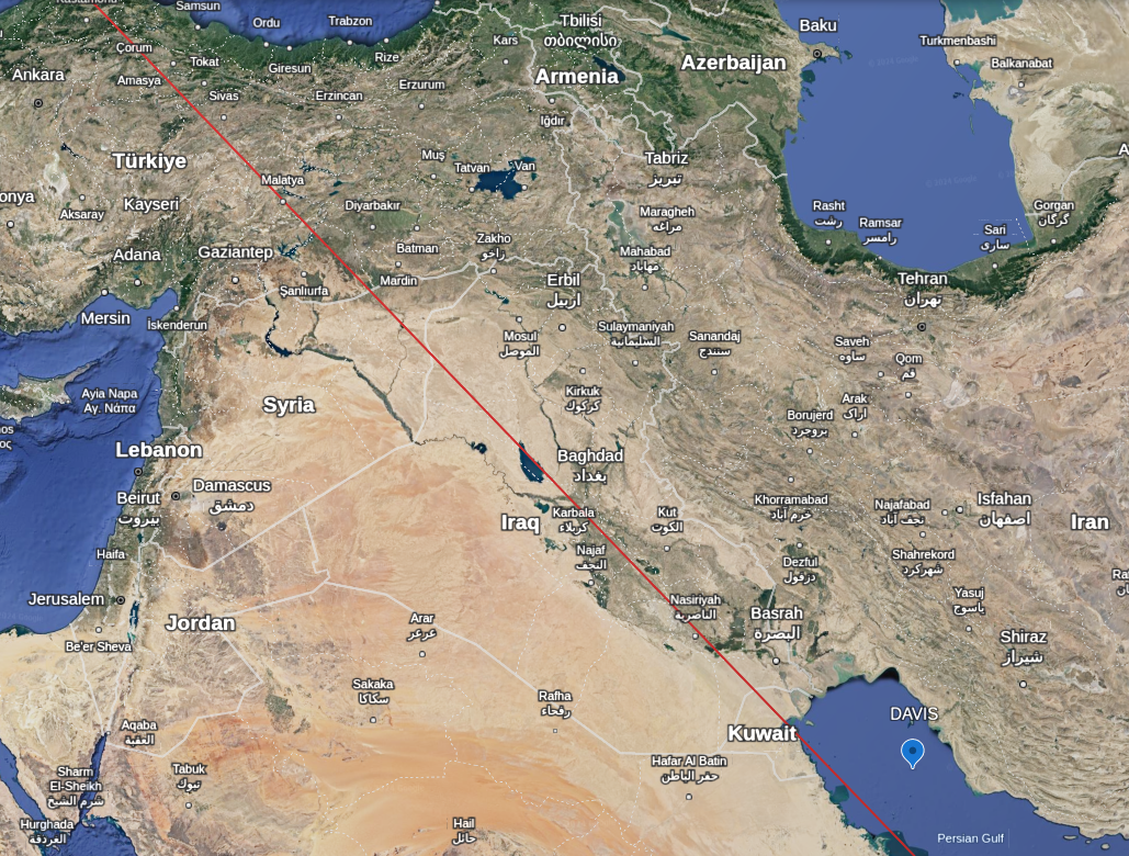
Now, its not always that the planes follow the path. Sometimes, due to issues such as restricted airspaces or weather, they take a detour and fly a slightly different path. As an example, lets take a plane flying from Boston to Dubai. You can see the image in the left below showing the path that it takes and the image on the right shows the shortest path between these two cities as shown by Google earth. The red lines in the image on the left show the airspace which is the portion of the atmosphere that is regulated by a certain authority. The plane is clearly avoiding the Syrian airspace and flying around it.
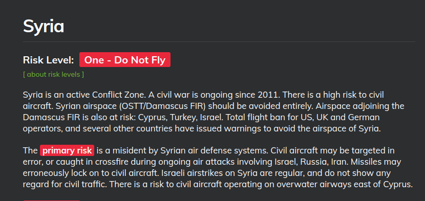
There is a website that you use to see which of the airspaces are safe to fly and the image below shows the Syrian airspace to be unsafe for civilian aircraft. Now you know why the unexpected deviation in flight path of the planes flying in that area.
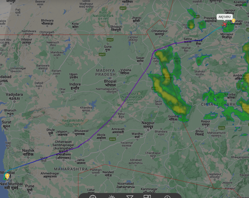
Sometimes, weather also causes a deviation in path as you can see in the image below. The flight from Mumbai to Varnasi takes a detour around a patch of intense precipitation.
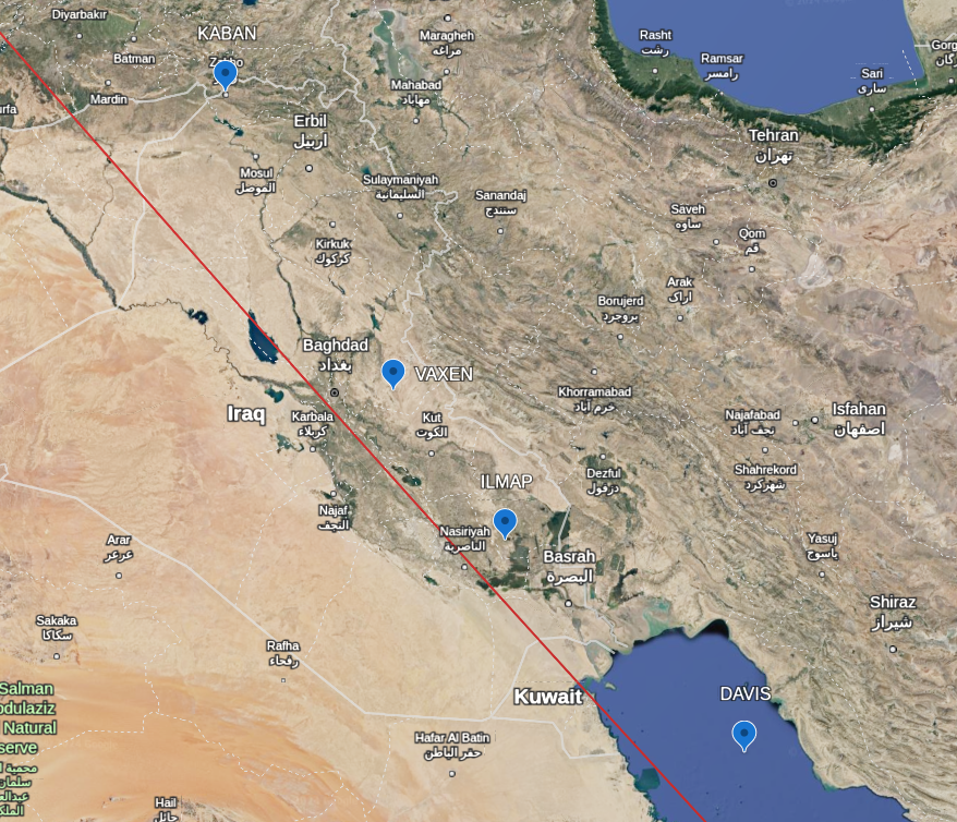
In the image below, I have plotted out a set of waypoints which are nothing but a specific set of coordinates that the aircraft use to navigate. They are kind of like landmarks, but imaginary. The red line is the path that we plotted before using google maps that sjows the shortest path between two places. You can see how those waypoints closely follow the line.
