The puzzling Mercator projection and how aircraft navigate
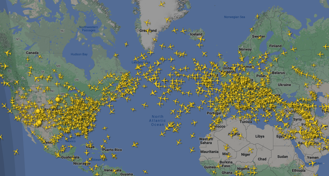
The Mercator projection — the map most of us grew up with in school and on almost every atlas — becomes deeply confusing the moment you learn how it was made. For most of my childhood I assumed Greenland was nearly as large as Africa and that Antarctica blanketed the entire southern half of the planet. Looking at the familiar classroom map, it is easy to see why.
In reality, the truth is very different. I only discovered this much later after watching a documentary about map projections. More recently, I came across a book titled Mapmatics by Paulina Rowinska, which promised to explain these projections and many other aspects of cartography. I ordered it immediately and I highly recommend it — it turned out to be a fascinating dive into how maps are constructed, full of things I had never stopped to consider.
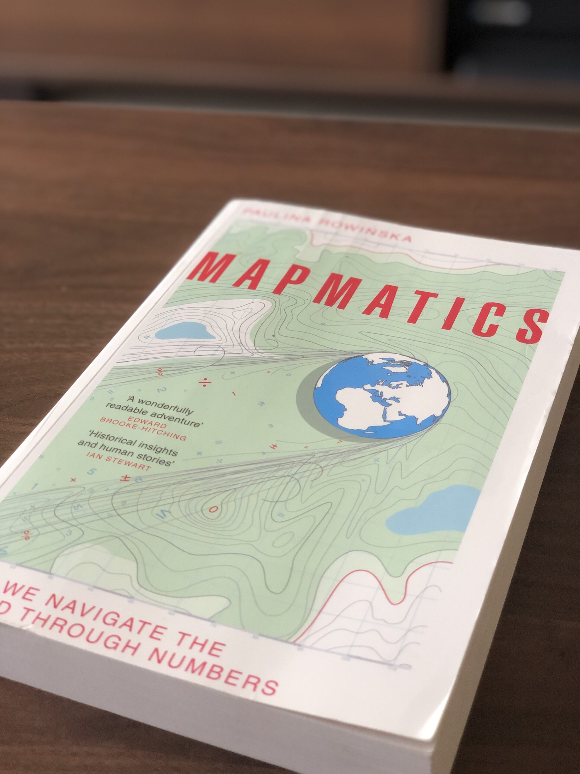 Mapmatics by Paulina Rowinska — a highly readable account of how maps shape our understanding of the world
The book opens by exploring how maps are made and how the Mercator projection came to be. The short version: you cannot accurately represent a sphere on a flat sheet of paper. To make it work, compromises must be made, and those compromises produce distortions — especially near the poles — which is what causes the confusion about the relative size of continents.
Gerardus Mercator, who originally designed this map, imagined a light source placed inside a transparent globe. The continents were drawn on the globe’s surface, and the light cast their shadows onto a flat sheet of paper placed alongside it. The resulting outlines formed the map we now recognise as the Mercator projection. This method preserves angles — which made it invaluable for sea navigation — but it is precisely what causes landmasses near the poles to appear far larger than they actually are.
The flight that changed how I think about maps
Another strange consequence of the Mercator projection shows up in everyday life: the digital maps we use constantly. Most online map services rely on it, and one flight in particular changed the way I thought about geography entirely.
While flying from Chicago to Delhi, I looked out the window and was certain I could see the Northern Lights. This made no sense to me at the time, because I had always assumed aircraft flew in straight lines across the map — the neat, flat paths drawn between cities in textbooks and on booking websites. That assumption turned out to be completely wrong, and the Mercator projection is largely to blame for it.
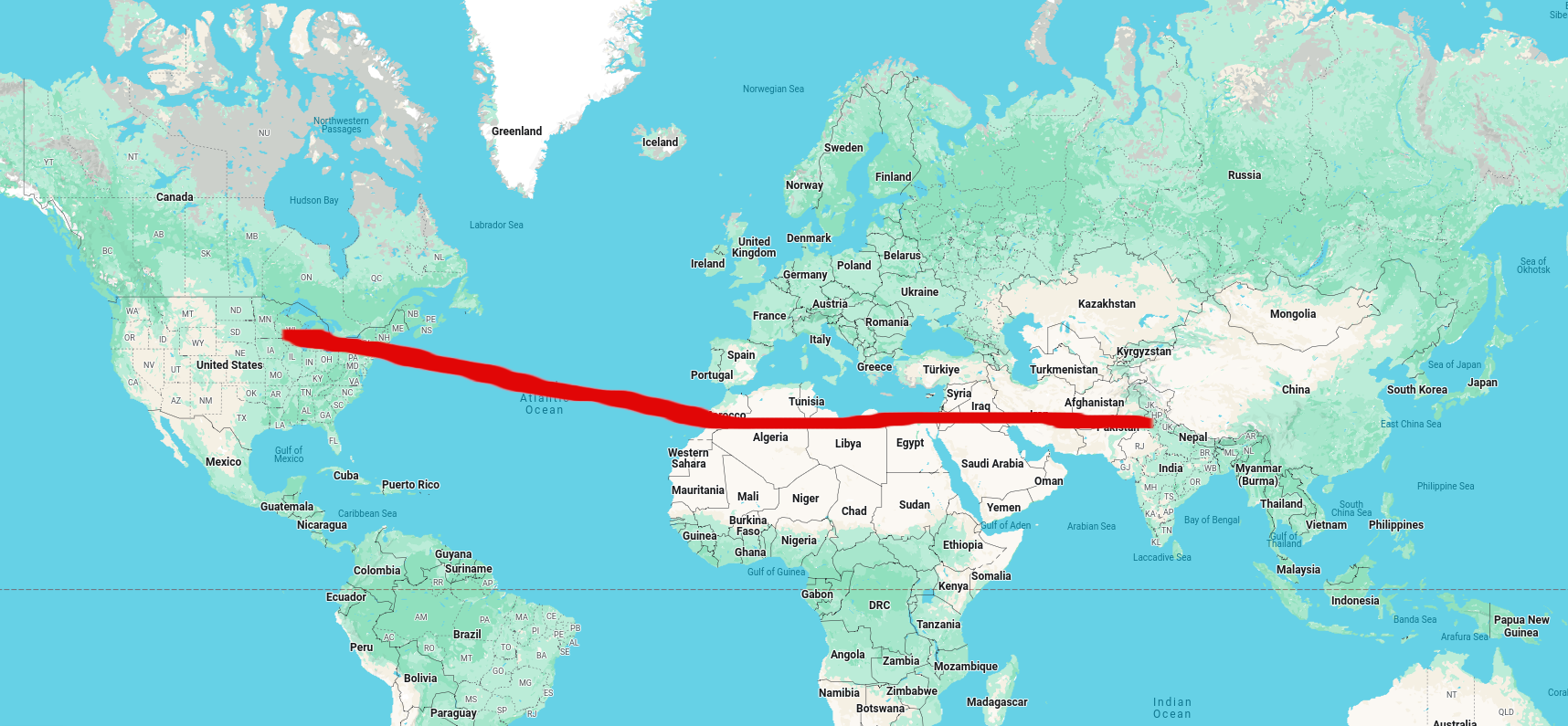 How a Chicago–Delhi flight looks on a flat Mercator map — a straight line that implies a mid-latitude route, far from the poles
The first clue came from the screen in front of my seat, which showed the aircraft’s actual route. It looked nothing like a straight line. Instead, we were arcing northward over Greenland — nowhere near where I imagined we should be. After doing some research, I discovered that aircraft routinely fly over Greenland on long-distance flights between North America and Asia. The reason becomes clear the moment you look at a globe.
The great-circle route
If you place two pins at the departure and destination on a globe and stretch a piece of string tightly between them, the string naturally traces almost exactly the path that aircraft fly. On a sphere, the shortest path between two points is called a great-circle route — it is the arc produced by a plane passing through both points and the centre of the Earth.
Google Earth lets you see this without a physical globe. I plotted the route between Atlanta, USA, and Doha, Qatar using the polygon tool in Google Earth:
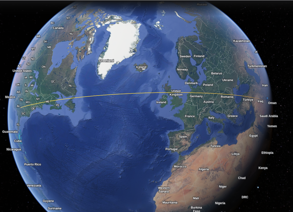 The shortest path between Atlanta and Doha, as plotted on Google Earth — it bends noticeably northward rather than crossing the Atlantic in a straight east–west line
The path bends northward, passing close to Greenland and the northern tip of the United Kingdom. This is not a quirk of Google Earth — it is the genuinely shortest distance between those two cities on a spherical Earth.
Real aircraft follow the same arc
To confirm that this is not just a theoretical path, we can look at Flightradar24. Zooming out on the site reveals dozens of aircraft crossing the Atlantic simultaneously. Even without route lines enabled, a pattern is visible. The pair of images below shows the same scene without and with flight paths enabled:
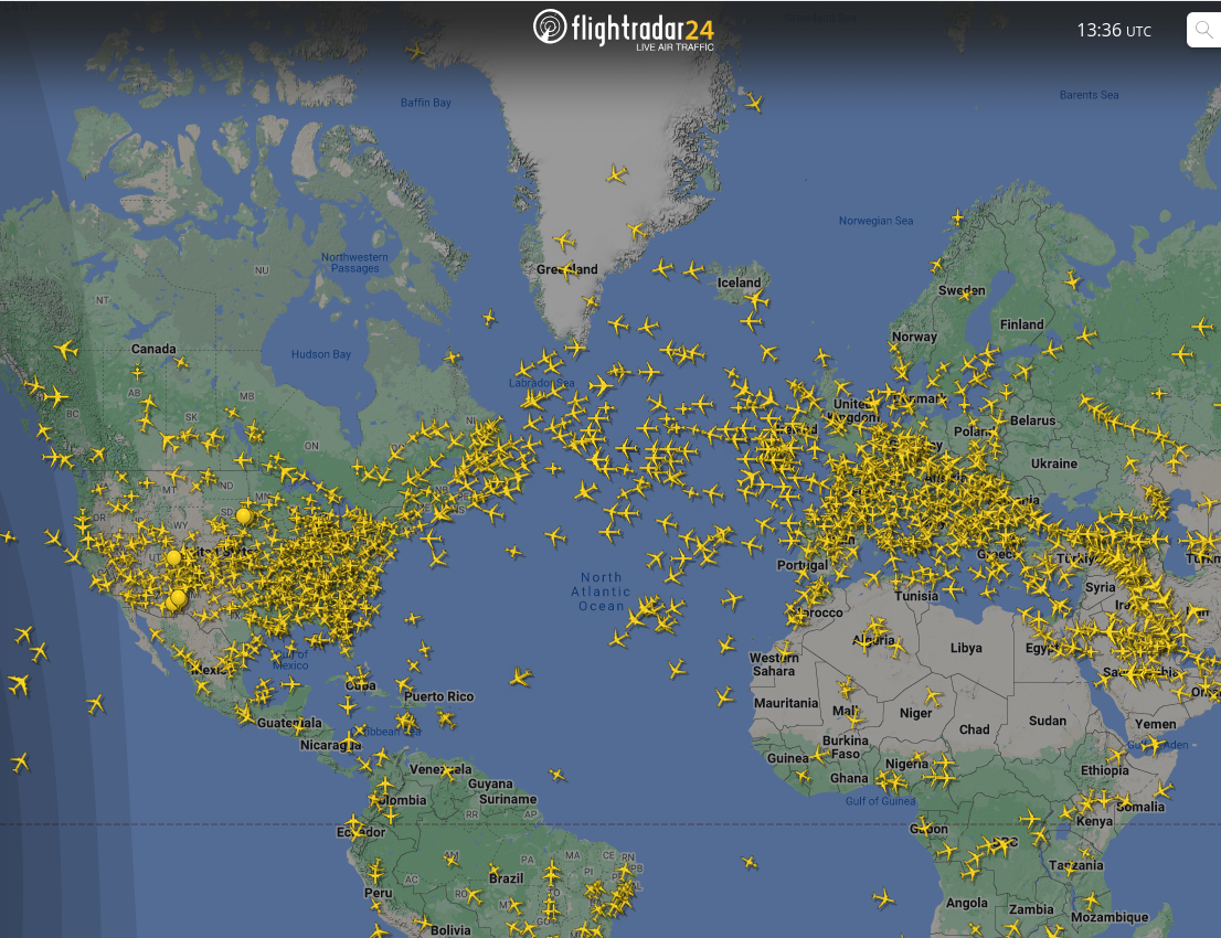 Aircraft positions across the Atlantic — without paths enabled, you can already sense a pattern in where they cluster
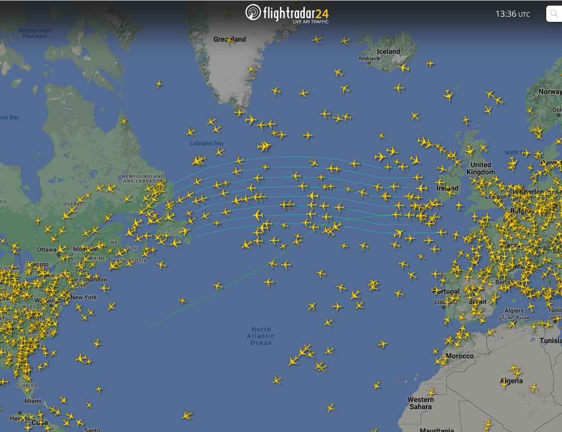 The same snapshot with paths enabled — the routes arc over the North Atlantic and Greenland, matching the Google Earth great-circle line closely
When the shortest path is not the one taken
Aircraft do not always fly the great-circle route exactly. Restricted airspace, geopolitical boundaries, and weather systems all force deviations. Consider a flight from Boston to Dubai. The pair of images below compares the actual path taken with the theoretical shortest route from Google Earth:
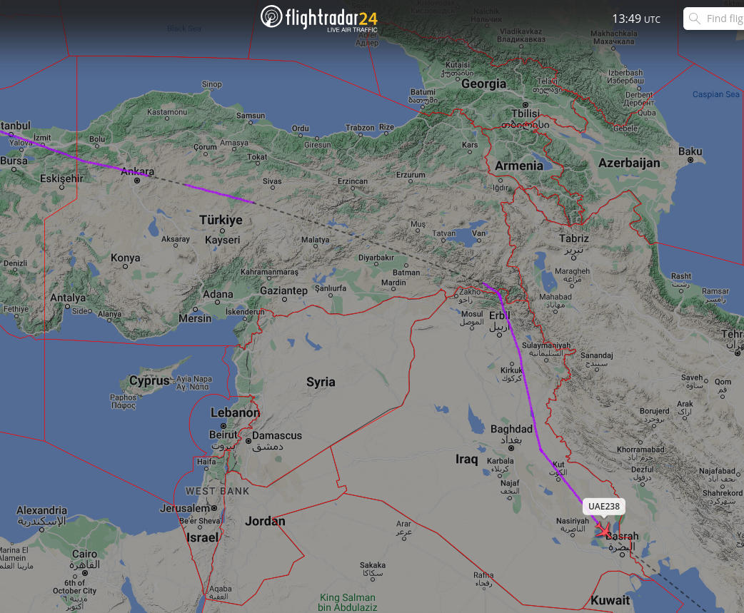 The actual Boston–Dubai flight path — red lines mark airspace boundaries; the aircraft loops around Syrian airspace before continuing toward the Persian Gulf
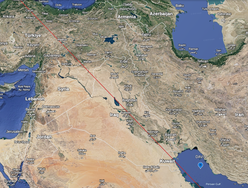 The unobstructed great-circle route between the same two cities — noticeably more direct than the path actually flown
The red lines in the left image mark controlled airspace boundaries. In this case the aircraft is clearly detouring around Syrian airspace. There are websites that track which airspaces are currently flagged as unsafe for civilian overflights:
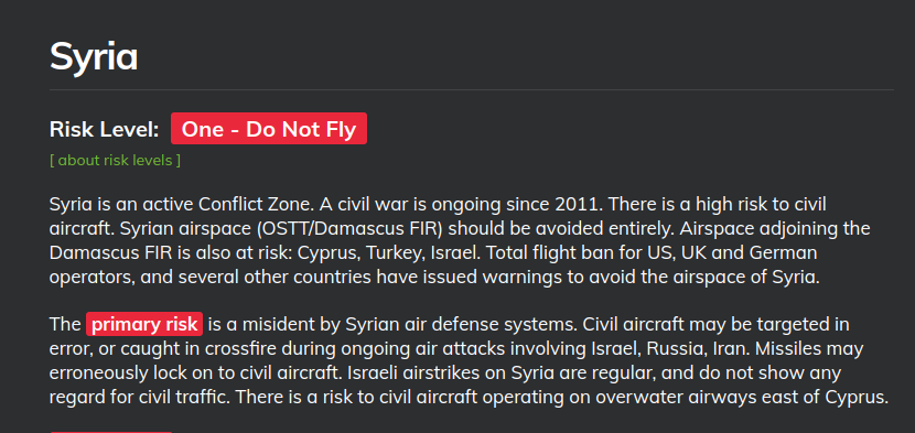 Syrian airspace shown as restricted for civilian overflights — the reason flights in that region arc around it rather than crossing directly
Weather can force similar detours. The flight below from Mumbai to Varanasi diverts around a patch of intense precipitation:
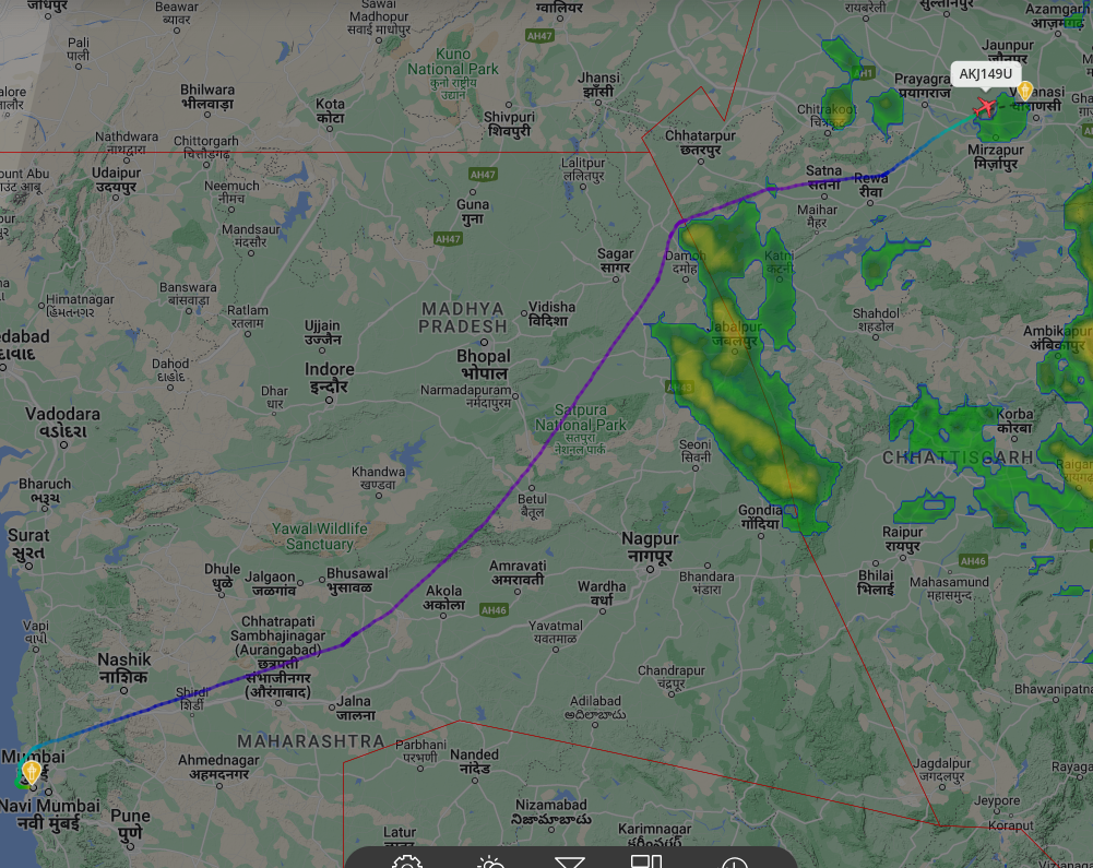 A Mumbai–Varanasi flight taking a detour to avoid a storm cell — weather routing in action
Waypoints: the invisible road network
Modern airliners do not fly freely across the sky. They move along a structured system of routes defined by waypoints — fixed geographic coordinates stored in navigation computers, forming an invisible network similar to a road system. On long-haul flights, these waypoint chains trace the great-circle arc as closely as practical constraints allow.
The image below overlays a set of real waypoints on the Google Earth great-circle line plotted earlier. The red line is the shortest path; the waypoints are the coordinates the aircraft actually files:
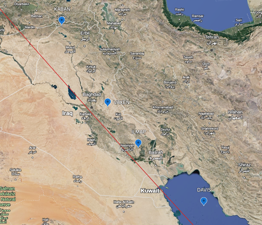 Actual navigation waypoints (plotted points) closely following the great-circle route (red line) — confirming that what aircraft do in practice matches the geometry
What this all adds up to
Our intuition about geography is shaped more by the maps we grew up with than by the geometry of the planet itself. The Mercator projection is genuinely useful for certain tasks — sea navigation being the prime example — but it quietly distorts our sense of how large continents are and how aircraft actually travel between them.
On a spherical Earth, the shortest path bends toward the poles, continents change scale dramatically with latitude, and a straight line on a flat map corresponds to a curved arc in the real world. Only when we look at a globe, or tools like Google Earth and Flightradar24, does an accurate picture of how the world really works start to emerge.